Custom Fields
General configuration
Custom fields support, using the custom_fields object, enables you to create your own fields on top of the pre-defined ones (name, state, label and icon). This is an advanced feature which leverages (if you require it) the CSS Grid.
Custom fields also support embedded cards, see example below.
Each custom field supports its own styling config, the name needs to match between both objects:
type: custom:button-card
[...]
custom_fields:
  test_element: My test element
styles:
  custom_fields:
    test_element:
      - color: red
      - font-size: 13px
Examples are better than a long text, so here you go:
Absolute element positioning
Placing an element wherever you want (that means bypassing the grid). Set the grid to position: relative and set the element to position: absolute
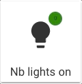
type: custom:button-card
icon: mdi:lightbulb
aspect_ratio: 1/1
name: No lights on
styles:
  grid:
    - position: relative
  custom_fields:
    notification:
      - background-color: |
          [[[
            if (states['input_number.test'].state == 0)
              return "green";
            return "red";
          ]]]
      - border-radius: 50%
      - position: absolute
      - left: 60%
      - top: 10%
      - height: 20px
      - width: 20px
      - font-size: 8px
      - line-height: 20px
custom_fields:
  notification: |
    [[[ return Math.floor(states['input_number.test'].state / 10) ]]]
Using grid-template-areas
Or you can use the grid. Each element will have its name positioned as the grid-area:

type: custom:button-card
entity: 'sensor.raspi_temp'
icon: 'mdi:raspberry-pi'
aspect_ratio: 1/1
name: HassOS
styles:
  card:
    - background-color: '#000044'
    - border-radius: 10%
    - padding: 10%
    - color: ivory
    - font-size: 10px
    - text-shadow: 0px 0px 5px black
    - text-transform: capitalize
  grid:
    - grid-template-areas: '"i temp" "n n" "cpu cpu" "ram ram" "sd sd"'
    - grid-template-columns: 1fr 1fr
    - grid-template-rows: 1fr min-content min-content min-content min-content
  name:
    - font-weight: bold
    - font-size: 13px
    - color: white
    - align-self: middle
    - justify-self: start
    - padding-bottom: 4px
  img_cell:
    - justify-content: start
    - align-items: start
    - margin: none
  icon:
    - color: |
        [[[
          if (entity.state < 60) return 'lime';
          if (entity.state >= 60 && entity.state < 80) return 'orange';
          else return 'red';
        ]]]
    - width: 70%
    - margin-top: -10%
  custom_fields:
    temp:
      - align-self: start
      - justify-self: end
    cpu:
      - padding-bottom: 2px
      - align-self: middle
      - justify-self: start
      - --text-color-sensor: '[[[ if (states["sensor.raspi_cpu"].state > 80) return "red"; ]]]'
    ram:
      - padding-bottom: 2px
      - align-self: middle
      - justify-self: start
      - --text-color-sensor: '[[[ if (states["sensor.raspi_ram"].state > 80) return "red"; ]]]'
    sd:
      - align-self: middle
      - justify-self: start
      - --text-color-sensor: '[[[ if (states["sensor.raspi_sd"].state > 80) return "red"; ]]]'
custom_fields:
  temp: |
    [[[
      return `<ha-icon
        icon="mdi:thermometer"
        style="width: 12px; height: 12px; color: yellow;">
        </ha-icon><span>${entity.state}°C</span>`
    ]]]
  cpu: |
    [[[
      return `<ha-icon
        icon="mdi:server"
        style="width: 12px; height: 12px; color: deepskyblue;">
        </ha-icon><span>CPU: <span style="color: var(--text-color-sensor);">${states['sensor.raspi_cpu'].state}%</span></span>`
    ]]]
  ram: |
    [[[
      return `<ha-icon
        icon="mdi:memory"
        style="width: 12px; height: 12px; color: deepskyblue;">
        </ha-icon><span>RAM: <span style="color: var(--text-color-sensor);">${states['sensor.raspi_ram'].state}%</span></span>`
    ]]]
  sd: |
    [[[
      return `<ha-icon
        icon="mdi:harddisk"
        style="width: 12px; height: 12px; color: deepskyblue;">
        </ha-icon><span>SD: <span style="color: var(--text-color-sensor);">${states['sensor.raspi_sd'].state}%</span></span>`
    ]]]
Nested card
Or you can embed a card (or multiple) inside the button card
Info
Some cards do not behave properly when their config is updated while already being displayed. In this case, you can set force_recreate: true. This will recreate the card every time there is an update. If you see weird behavior with nested cards (eg. not updating), try this setting.
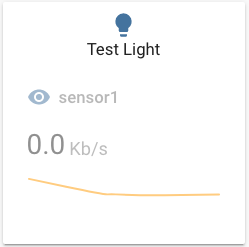
type: custom:button-card
aspect_ratio: 1/1
custom_fields:
  graph:
    card:
      type: sensor
      entity: sensor.sensor1
      graph: line
      card_mod: # (1)!
        style: |
          ha-card {
            box-shadow: none;
          }
styles:
  custom_fields:
    graph:
      - filter: opacity(50%)
      - overflow: unset
  card:
    - overflow: unset
  grid:
    - grid-template-areas: '"i" "n" "graph"'
    - grid-template-columns: 1fr
    - grid-template-rows: 1fr min-content min-content
entity: light.test_light
hold_action:
  action: more-info
-
This configuration uses card-mod to remove the
box-shadowof the sensor card.This is what the
styleinside the embedded card is for.
Nested cards with JS templates
To use nested templates in a custom_field (eg. you embed a custom:button-card inside a Custom Field and then template is for the custom:button-card), then use an extra [] pair around your template. You may also set do_not_eval to true to skip evaluating the template (DEPRECATED). See JS Templates for more information on using templates in nested custom:button-card.
type: custom:button-card
styles:
  grid:
    - grid-template-areas: "'test1' 'nested_template' 'deprecated'"
variables:
  b: 42
custom_fields:
  test1:
    card:
      type: custom:button-card
      variables:
        c: 42
      name: '[[[ return `B: ${variables.b} / C: ${variables.c}` ]]]' # (1)!
  nested_template:
    card:
      type: custom:button-card
      variables:
        c: 42
      name: '[[[[ return `B: ${variables.b} / C: ${variables.c}` ]]]]' # (2)!
  deprecated:
    do_not_eval: true # (3)!
    card:
      type: custom:button-card
      variables:
        c: 42
      name: '[[[ return `B: ${variables.b} / C: ${variables.c}` ]]]' # (4)!
- This will return: B: 42 / C: undefined as it is evaluated in the context of the main card (which doesn't know about c)
- This will return: B: undefined / C: 42 as it is evaluated in the context of the local button-card inside the custom_field (which doesn't know about b)
- (DEPRECATED) This stops the evaluation of js templates for the card object in this custom field
- This will return: B: undefined / C: 42 as it is evaluated in the context of the local button-card inside the custom_field (which doesn't know about b)
Custom Fields as JS Templates
You can also set the whole custom_fields object as a JS template, this allows you to create custom fields dynamically based on the state of an entity or whatever you want.
If you want to apply styles to them as well, you can also set the styles.custom_fields as a JS template that returns an object with the same keys as the custom fields and the styles you want to apply to them.
This is useful if you want to show/hide custom fields based on the state of an entity, or if you want to change the card inside a custom field based on the state of an entity, etc...
type: custom:button-card
name: |
  <b>Custom Fields as a JS Template.</b> <br/>
  Shows a red background and a markdown card if sensor1 is 0 <br/>
  Shows a blue background with an entity card if it's above 0.
variables:
  card1:
    card:
      type: markdown
      content: 'This is a custom field with a markdown card'
  card2:
    card:
      type: entity
      entity: sensor.sensor1
custom_fields: |
  [[[
    if (hass.states["sensor.sensor1"].state == 0) {
      return {
        test: variables.card1,
      }
    } else {
      return {
        test: variables.card2,
      }
    }
  ]]]
styles:
  grid:
    - grid-template-areas: '"n" "test"'
    - grid-template-columns: 1fr
    - grid-template-rows: min-content 1fr
  custom_fields: |
    [[[
      return {
        test: [
          { 'background-color': 'blue' },
          { padding: '10px' },
          { 'border-radius': '10px' },
        ],
      }
    ]]]
state:
  - value: '[[[ return hass.states["sensor.sensor1"].state > 0 ]]]'
    operator: template
    styles:
      custom_fields: |
        [[[
          return {
            test: [
              { 'background-color': 'green' },
              { padding: '20px' },
            ],
          }
        ]]]
  - value: '[[[ return hass.states["sensor.sensor1"].state == 0 ]]]'
    operator: template
    styles:
      custom_fields:
        test:
          - background-color: red